SoFi Design System
Designing and maintaing a set of Sketch components for the the product design team. Collaborating with engineering with documentation and launching of SCUID-X, the first version of SoFi's shared components on the web.
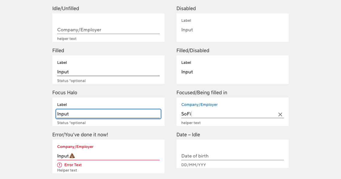
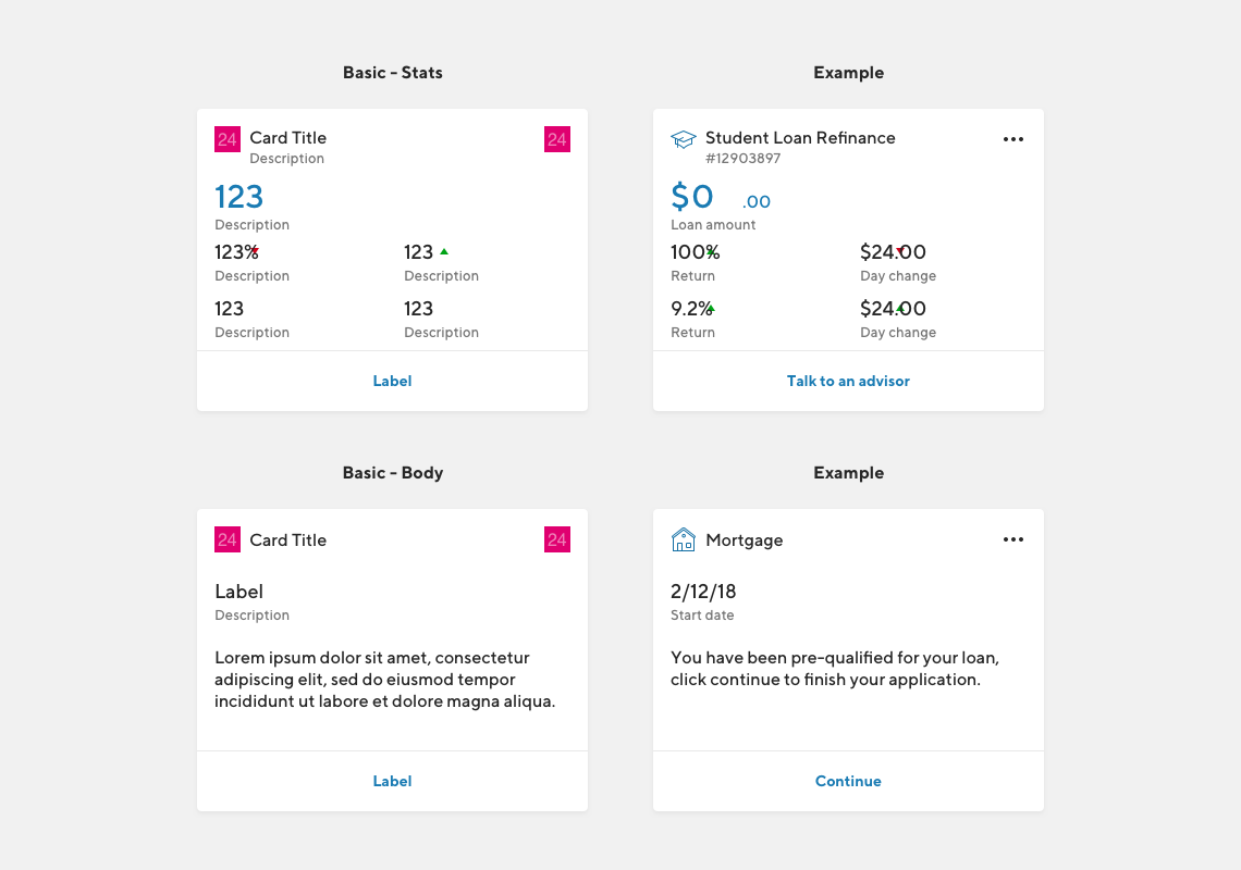
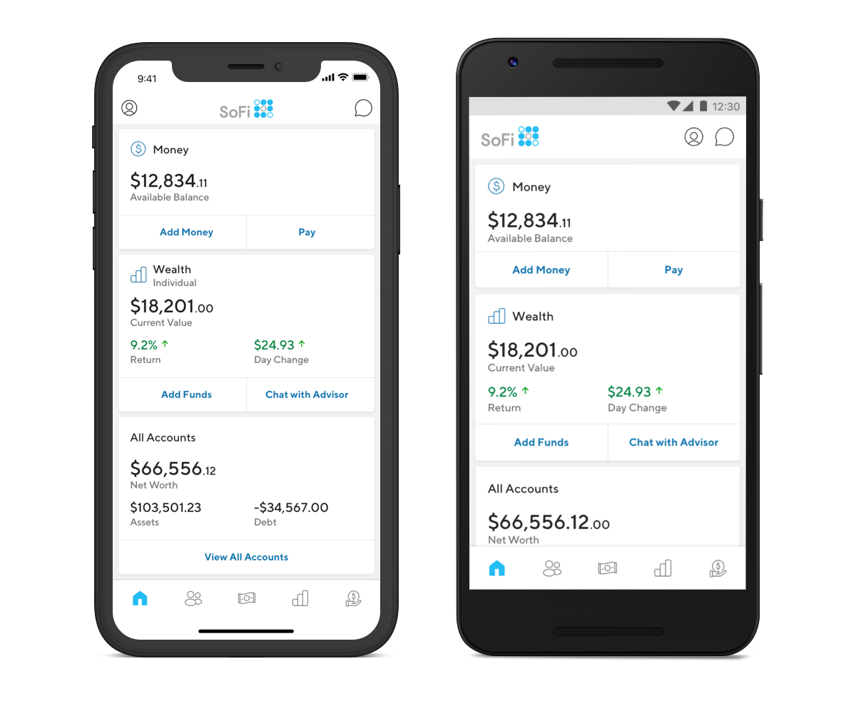
Component library
Role & responsibilities
System design, visual design, component creation, documentation. This version of the system I was the lead with one other designer helping out. We grew the team as the system expanded. This version has evolved into what SoFi is currently using.
Goal
Define and document common components for the larger product design team. Build Sketch library that could be consumed by all team members. This library would become the starting point for newly created screens and would include both common components as well as text styles, icons and colors. Write online documentation for components. Collaborate with engineering to provide code specific examples for front end engineers.
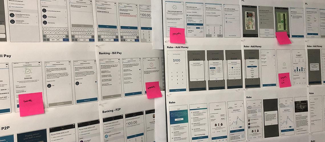
Process
We conducted an audit of our screens. We identified common screens and solidified patterns and common components, buttons, input fields, text sizes and colors. Once we identified the most bang for our buck we started to product the Sketch components and deliver them to teams over time. While we built components we collaborated with teams on improvements to common core patterns. We worked directly with engineers to get components coded for front end engineers.
What we shipped
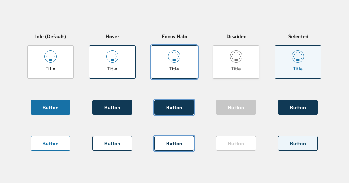
Sketch component library that contained a set of key components for screen creation on the web and native mobile screens. Highly used components for rows, buttons and navigation. A set of consistent colors and type combinations that were WCAG AA compliant. A huge set of icons and other UI elements.
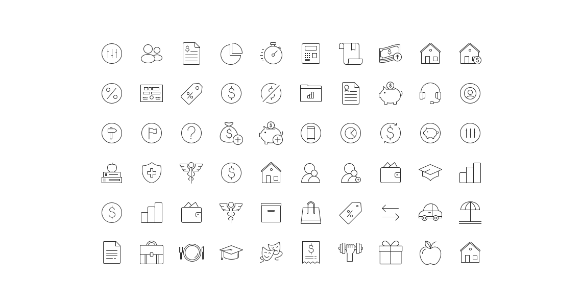
What I learned
Building and maintaining a design system can't be a single person job. While working on the first version of the system we grew the core team. Design systems really succeed when all members of the design team respect the system and contribute to it. While one team can spend the most time with the system. It's up to the entire design team to use it, maintain it and help it grow.
More Sofi work
Build your own watchlist
Empowering members to curate their stock watchlist with what matters to them.
View case study
Illustrations
Friendly and colorful elements to brighten up stark white screens. With a pinch of SoFi attitude.
View project
Selected Work